
昨晚用CSS3实现了几种常见的Loading效果,虽然很简单,但还是分享一下,顺便也当是做做笔记……
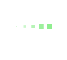
第一种效果

代码如下:
<div class="loading">
        <span></span>
        <span></span>
        <span></span>
        <span></span>
        <span></span>
</div>
.loading{
            width: 80px;
            height: 40px;
            margin: 0 auto;
            margin-top:100px;
        }
        .loading span{
            display: inline-block;
            width: 8px;
            height: 100%;
            border-radius: 4px;
            background: lightgreen;
            -webkit-animation: load 1s ease infinite;
        }
        @-webkit-keyframes load{
            0%,100%{
                height: 40px;
                background: lightgreen;
            }
            50%{
                height: 70px;
                margin: -15px 0;
                background: lightblue;
            }
        }
        .loading span:nth-child(2){
            -webkit-animation-delay:0.2s;
        }
        .loading span:nth-child(3){
            -webkit-animation-delay:0.4s;
        }
        .loading span:nth-child(4){
            -webkit-animation-delay:0.6s;
        }
        .loading span:nth-child(5){
            -webkit-animation-delay:0.8s;
        }
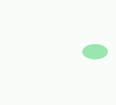
第2种效果:
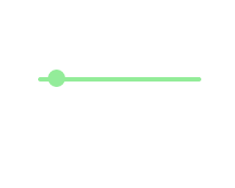
代码如下:
<div class="loading">
        <span></span>
</div>
.loading{
            width: 150px;
            height: 4px;
            border-radius: 2px;
            margin: 0 auto;
            margin-top:100px;
            position: relative;
            background: lightgreen;
            -webkit-animation: changeBgColor 1.04s ease-in infinite alternate;
        }
        .loading span{
            display: inline-block;
            width: 16px;
            height: 16px;
            border-radius: 50%;
            background: lightgreen;
            position: absolute;
            margin-top: -7px;
            margin-left:-8px;
            -webkit-animation: changePosition 1.04s ease-in infinite alternate;
        }
        @-webkit-keyframes changeBgColor{
            0%{
                background: lightgreen;
            }
            100%{
                background: lightblue;
            }
        }
        @-webkit-keyframes changePosition{
            0%{
                background: lightgreen;
            }
            100%{
                margin-left: 142px;
                background: lightblue;
            }
        }
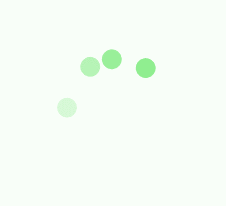
第3-5种效果:

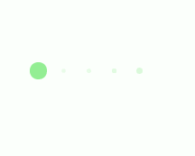
代码如下:
<div class="loading">
        <span></span>
        <span></span>
        <span></span>
        <span></span>
        <span></span>
</div>
第3-5种效果的css样式分别为:
.loading{
            width: 150px;
            height: 15px;
            margin: 0 auto;
            margin-top:100px;
        }
        .loading span{
            display: inline-block;
            width: 15px;
            height: 100%;
            margin-right: 5px;
            border-radius: 50%;
            background: lightgreen;
            -webkit-animation: load 1.04s ease infinite;
        }
        .loading span:last-child{
            margin-right: 0px;
        }
        @-webkit-keyframes load{
            0%{
                opacity: 1;
            }
            100%{
                opacity: 0;
            }
        }
        .loading span:nth-child(1){
            -webkit-animation-delay:0.13s;
        }
        .loading span:nth-child(2){
            -webkit-animation-delay:0.26s;
        }
        .loading span:nth-child(3){
            -webkit-animation-delay:0.39s;
        }
        .loading span:nth-child(4){
            -webkit-animation-delay:0.52s;
        }
        .loading span:nth-child(5){
            -webkit-animation-delay:0.65s;
        }
.loading{
            width: 150px;
            height: 15px;
            margin: 0 auto;
            margin-top:100px;
        }
        .loading span{
            display: inline-block;
            width: 15px;
            height: 100%;
            margin-right: 5px;
            border-radius: 50%;
            background: lightgreen;
            -webkit-animation: load 1.04s ease infinite;
        }
        .loading span:last-child{
            margin-right: 0px;
        }
        @-webkit-keyframes load{
            0%{
                opacity: 1;
                -webkit-transform: scale(1.3);
            }
            100%{
                opacity: 0.2;
                -webkit-transform: scale(.3);
            }
        }
        .loading span:nth-child(1){
            -webkit-animation-delay:0.13s;
        }
        .loading span:nth-child(2){
            -webkit-animation-delay:0.26s;
        }
        .loading span:nth-child(3){
            -webkit-animation-delay:0.39s;
        }
        .loading span:nth-child(4){
            -webkit-animation-delay:0.52s;
        }
        .loading span:nth-child(5){
            -webkit-animation-delay:0.65s;
        }
.loading{
            width: 150px;
            height: 15px;
            margin: 0 auto;
            position: relative;
            margin-top:100px;
        }
        .loading span{
            position: absolute;
            width: 15px;
            height: 100%;
            border-radius: 50%;
            background: lightgreen;
            -webkit-animation: load 1.04s ease-in infinite alternate;
        }
        @-webkit-keyframes load{
            0%{
                opacity: 1;
                -webkit-transform: translate(0px);
            }
            100%{
                opacity: 0.2;
                -webkit-transform: translate(150px);
            }
        }
        .loading span:nth-child(1){
            -webkit-animation-delay:0.13s;
        }
        .loading span:nth-child(2){
            -webkit-animation-delay:0.26s;
        }
        .loading span:nth-child(3){
            -webkit-animation-delay:0.39s;
        }
        .loading span:nth-child(4){
            -webkit-animation-delay:0.52s;
        }
        .loading span:nth-child(5){
            -webkit-animation-delay:0.65s;
        }
第6-8种效果:


代码如下:
<div class="loading">
        <span></span>
        <span></span>
        <span></span>
        <span></span>
        <span></span>
</div>
第6-8种效果的css样式分别为:
.loading{
            width: 150px;
            height: 15px;
            margin: 0 auto;
            margin-top:100px;
            text-align: center;
        }
        .loading span{
            display: inline-block;
            width: 15px;
            height: 100%;
            margin-right: 5px;
            background: lightgreen;
            -webkit-animation: load 1.04s ease infinite;
        }
        .loading span:last-child{
            margin-right: 0px;
        }
        @-webkit-keyframes load{
            0%{
                opacity: 1;
            }
            100%{
                opacity: 0;
            }
        }
        .loading span:nth-child(1){
            -webkit-animation-delay:0.13s;
        }
        .loading span:nth-child(2){
            -webkit-animation-delay:0.26s;
        }
        .loading span:nth-child(3){
            -webkit-animation-delay:0.39s;
        }
        .loading span:nth-child(4){
            -webkit-animation-delay:0.52s;
        }
        .loading span:nth-child(5){
            -webkit-animation-delay:0.65s;
        }
.loading{
            width: 150px;
            height: 15px;
            margin: 0 auto;
            margin-top:100px;
        }
        .loading span{
            display: inline-block;
            width: 15px;
            height: 100%;
            margin-right: 5px;
            background: lightgreen;
            -webkit-transform-origin: right bottom;
            -webkit-animation: load 1s ease infinite;
        }
        .loading span:last-child{
            margin-right: 0px;
        }
        @-webkit-keyframes load{
            0%{
                opacity: 1;
            }
            100%{
                opacity: 0;
                -webkit-transform: rotate(90deg);
            }
        }
        .loading span:nth-child(1){
            -webkit-animation-delay:0.13s;
        }
        .loading span:nth-child(2){
            -webkit-animation-delay:0.26s;
        }
        .loading span:nth-child(3){
            -webkit-animation-delay:0.39s;
        }
        .loading span:nth-child(4){
            -webkit-animation-delay:0.52s;
        }
        .loading span:nth-child(5){
            -webkit-animation-delay:0.65s;
        }
.loading{
            width: 150px;
            height: 15px;
            margin: 0 auto;
            margin-top:100px;
        }
        .loading span{
            display: inline-block;
            width: 15px;
            height: 100%;
            margin-right: 5px;
            background: lightgreen;
            -webkit-transform-origin: right bottom;
            -webkit-animation: load 1s ease infinite;
        }
        .loading span:last-child{
            margin-right: 0px;
        }
        @-webkit-keyframes load{
            0%{
                opacity: 1;
                -webkit-transform: scale(1);
            }
            100%{
                opacity: 0;
                -webkit-transform: rotate(90deg) scale(.3);
            }
        }
        .loading span:nth-child(1){
            -webkit-animation-delay:0.13s;
        }
        .loading span:nth-child(2){
            -webkit-animation-delay:0.26s;
        }
        .loading span:nth-child(3){
            -webkit-animation-delay:0.39s;
        }
        .loading span:nth-child(4){
            -webkit-animation-delay:0.52s;
        }
        .loading span:nth-child(5){
            -webkit-animation-delay:0.65s;
        }
第9-10种效果:


代码如下:
<div class="loadEffect">
        <span></span>
        <span></span>
        <span></span>
        <span></span>
        <span></span>
        <span></span>
        <span></span>
        <span></span>
</div>
CSS样式分别为:
.loadEffect{
            width: 100px;
            height: 100px;
            position: relative;
            margin: 0 auto;
            margin-top:100px;
        }
        .loadEffect span{
            display: inline-block;
            width: 16px;
            height: 16px;
            border-radius: 50%;
            background: lightgreen;
            position: absolute;
            -webkit-animation: load 1.04s ease infinite;
        }
        @-webkit-keyframes load{
            0%{
                opacity: 1;
            }
            100%{
                opacity: 0.2;
            }
        }
        .loadEffect span:nth-child(1){
            left: 0;
            top: 50%;
            margin-top:-8px;
            -webkit-animation-delay:0.13s;
        }
        .loadEffect span:nth-child(2){
            left: 14px;
            top: 14px;
            -webkit-animation-delay:0.26s;
        }
        .loadEffect span:nth-child(3){
            left: 50%;
            top: 0;
            margin-left: -8px;
            -webkit-animation-delay:0.39s;
        }
        .loadEffect span:nth-child(4){
            top: 14px;
            right:14px;
            -webkit-animation-delay:0.52s;
        }
        .loadEffect span:nth-child(5){
            right: 0;
            top: 50%;
            margin-top:-8px;
            -webkit-animation-delay:0.65s;
        }
        .loadEffect span:nth-child(6){
            right: 14px;
            bottom:14px;
            -webkit-animation-delay:0.78s;
        }
        .loadEffect span:nth-child(7){
            bottom: 0;
            left: 50%;
            margin-left: -8px;
            -webkit-animation-delay:0.91s;
        }
        .loadEffect span:nth-child(8){
            bottom: 14px;
            left: 14px;
            -webkit-animation-delay:1.04s;
        }
.loadEffect{
            width: 100px;
            height: 100px;
            position: relative;
            margin: 0 auto;
            margin-top:100px;
        }
        .loadEffect span{
            display: inline-block;
            width: 20px;
            height: 20px;
            border-radius: 50%;
            background: lightgreen;
            position: absolute;
            -webkit-animation: load 1.04s ease infinite;
        }
        @-webkit-keyframes load{
            0%{
                -webkit-transform: scale(1.2);
                opacity: 1;
            }
            100%{
                -webkit-transform: scale(.3);
                opacity: 0.5;
            }
        }
        .loadEffect span:nth-child(1){
            left: 0;
            top: 50%;
            margin-top:-10px;
            -webkit-animation-delay:0.13s;
        }
        .loadEffect span:nth-child(2){
            left: 14px;
            top: 14px;
            -webkit-animation-delay:0.26s;
        }
        .loadEffect span:nth-child(3){
            left: 50%;
            top: 0;
            margin-left: -10px;
            -webkit-animation-delay:0.39s;
        }
        .loadEffect span:nth-child(4){
            top: 14px;
            right:14px;
            -webkit-animation-delay:0.52s;
        }
        .loadEffect span:nth-child(5){
            right: 0;
            top: 50%;
            margin-top:-10px;
            -webkit-animation-delay:0.65s;
        }
        .loadEffect span:nth-child(6){
            right: 14px;
            bottom:14px;
            -webkit-animation-delay:0.78s;
        }
        .loadEffect span:nth-child(7){
            bottom: 0;
            left: 50%;
            margin-left: -10px;
            -webkit-animation-delay:0.91s;
        }
        .loadEffect span:nth-child(8){
            bottom: 14px;
            left: 14px;
            -webkit-animation-delay:1.04s;
        }
第11种效果:

代码如下:
<div class="loading">
        <span></span>
        <span></span>
        <span></span>
        <span></span>
        <span></span>
</div>
.loading{
            width: 80px;
            height: 40px;
            margin: 0 auto;
            margin-top:100px;
        }
        .loading span{
            display: inline-block;
            width: 8px;
            height: 100%;
            border-radius: 4px;
            background: lightgreen;
            -webkit-animation: load 1.04s ease infinite;
        }
        @-webkit-keyframes load{
            0%,100%{
                height: 40px;
                background: lightgreen;
            }
            50%{
                height: 60px;
                margin-top: -20px;
                background: lightblue;
            }
        }
        .loading span:nth-child(2){
            -webkit-animation-delay:0.13s;
        }
        .loading span:nth-child(3){
            -webkit-animation-delay:0.26s;
        }
        .loading span:nth-child(4){
            -webkit-animation-delay:0.39s;
        }
        .loading span:nth-child(5){
            -webkit-animation-delay:0.52s;
        }
第12种效果:

代码如下:
<div class="loading">
        <span></span>
</div>
.loading{
            width: 80px;
            height: 80px;
            border-radius: 50%;
            margin: 0 auto;
            margin-top:100px;
            position: relative;
            border:5px solid lightgreen;
            -webkit-animation: turn 2s linear infinite;
        }
        .loading span{
            display: inline-block;
            width: 30px;
            height: 30px;
            border-radius: 50%;
            background: lightgreen;
            position: absolute;
            left: 50%;
            margin-top: -15px;
            margin-left: -15px;
            -webkit-animation: changeBgColor 2s linear infinite;
        }
        @-webkit-keyframes changeBgColor{
            0%{
                background: lightgreen;
            }
            100%{
                background: lightblue;
            }
        }
        @-webkit-keyframes turn{
            0%{
                -webkit-transform: rotate(0deg);
                border-color: lightgreen;
            }
            100%{
                -webkit-transform: rotate(360deg);
                border-color: lightblue;
            }
        }
第13种效果:
代码如下:
<div class="loading">
        <span></span>
        <span></span>
        <span></span>
        <span></span>
        <span></span>
</div>
.loading{
            width: 150px;
            height: 15px;
            margin: 0 auto;
            margin-top:100px;
            text-align: center;
        }
        .loading span{
            display: inline-block;
            width: 15px;
            height: 100%;
            margin-right: 5px;
            background: lightgreen;
            -webkit-animation: load 1.04s ease infinite;
        }
        .loading span:last-child{
            margin-right: 0px;
        }
        @-webkit-keyframes load{
            0%{
                opacity: 1;
                -webkit-transform: scale(1.2);
            }
            100%{
                opacity: .2;
                -webkit-transform: scale(.2);
            }
        }
        .loading span:nth-child(1){
            -webkit-animation-delay:0.13s;
        }
        .loading span:nth-child(2){
            -webkit-animation-delay:0.26s;
        }
        .loading span:nth-child(3){
            -webkit-animation-delay:0.39s;
        }
        .loading span:nth-child(4){
            -webkit-animation-delay:0.52s;
        }
        .loading span:nth-child(5){
            -webkit-animation-delay:0.65s;
        }
第14种效果:

代码如下:
<div class="loading">
        <span></span>
</div>
.loading{
            width: 150px;
            height: 8px;
            border-radius: 4px;
            margin: 0 auto;
            margin-top:100px;
            position: relative;
            background: lightblue;
            overflow: hidden;
        }
        .loading span{
            display:block;
            width: 100%;
            height: 100%;
            border-radius: 3px;
            background: lightgreen;
            -webkit-animation: changePosition 4s linear infinite;
        }
        @-webkit-keyframes changePosition{
            0%{
                -webkit-transform: translate(-150px);
            }
            50%{
                -webkit-transform: translate(0);
            }
            100%{
                -webkit-transform: translate(150px);
            }
        }
第15种效果:
代码如下:
<div class="loading">
        <span></span>
</div>
.loading{
            width: 200px;
            height: 60px;
            margin: 0 auto;
            margin-top: 100px;
            position: relative;
        }
        .loading span{
            width: 50px;
            height: 30px;
            border-radius: 50%;
            background: lightgreen;
            position: absolute;
            top: 50%;
            margin-top: -15px;
            overflow: hidden;
            -webkit-animation: changePosition 2.08s linear infinite;
        }
        @-webkit-keyframes changePosition{
            0%,100%{
                -webkit-transform: translate(70px);
            }
            20%{
                width: 50px;
                height: 30px;
                margin-top:-15px;
                -webkit-transform: translate(0px);
            }
            30%{
                width: 20px;
                height: 60px;
                margin-top:-30px;
                -webkit-transform: translate(0px);
            }
            35%{
                width: 50px;
                height: 30px;
                margin-top:-15px;
                -webkit-transform: translate(5px);
                background: lightblue;
            }
            70%{
                width: 50px;
                height: 30px;
                margin-top:-15px;
                -webkit-transform: translate(160px);
            }
            80%{
                width: 20px;
                height: 60px;
                margin-top:-30px;
                -webkit-transform: translate(160px);
            }
            85%{
                width: 50px;
                height: 30px;
                margin-top:-15px;
                -webkit-transform: translate(155px);
                background: lightgreen;
            }

        }
第16种效果:

代码如下:
<div class="loadEffect">
        <span></span>
        <span></span>
        <span></span>
        <span></span>
        <span></span>
        <span></span>
        <span></span>
        <span></span>
</div>
.loadEffect{
            width: 100px;
            height: 100px;
            position: relative;
            margin: 0 auto;
            margin-top:100px;
        }
        .loadEffect span{
            display: inline-block;
            width: 30px;
            height: 10px;
            border-top-left-radius: 5px;
            border-bottom-left-radius: 5px;
            background: lightgreen;
            position: absolute;
            -webkit-animation: load 1.04s ease infinite;
        }
        @-webkit-keyframes load{
            0%{
                opacity: 1;
            }
            100%{
                opacity: 0.2;
            }
        }
        .loadEffect span:nth-child(1){
            left: 0;
            top: 50%;
            margin-top:-5px;
            -webkit-animation-delay:0.13s;
        }
        .loadEffect span:nth-child(2){
            left: 10px;
            top: 20px;
            -webkit-transform: rotate(45deg);
            -webkit-animation-delay:0.26s;
        }
        .loadEffect span:nth-child(3){
            left: 50%;
            top: 10px;
            margin-left: -15px;
            -webkit-transform: rotate(90deg);
            -webkit-animation-delay:0.39s;
        }
        .loadEffect span:nth-child(4){
            top: 20px;
            right:10px;
            -webkit-transform: rotate(135deg);
            -webkit-animation-delay:0.52s;
        }
        .loadEffect span:nth-child(5){
            right: 0;
            top: 50%;
            margin-top:-5px;
            -webkit-transform: rotate(180deg);
            -webkit-animation-delay:0.65s;
        }
        .loadEffect span:nth-child(6){
            right: 10px;
            bottom:20px;
            -webkit-transform: rotate(225deg);
            -webkit-animation-delay:0.78s;
        }
        .loadEffect span:nth-child(7){
            bottom: 10px;
            left: 50%;
            margin-left: -15px;
            -webkit-transform: rotate(270deg);
            -webkit-animation-delay:0.91s;
        }
        .loadEffect span:nth-child(8){
            bottom: 20px;
            left: 10px;
            -webkit-transform: rotate(315deg);
            -webkit-animation-delay:1.04s;
        }
第17种效果:
代码如下:
<div class="loadEffect">
        <div><span></span></div>
        <div><span></span></div>
        <div><span></span></div>
        <div><span></span></div>
</div>
.loadEffect {
            width: 100px;
            height: 100px;
            margin: 0 auto;
            margin-top:100px;
            position: relative;
        }
        .loadEffect div{
            width: 100%;
            height: 100%;
            position: absolute;
            -webkit-animation: load 2.08s linear infinite;
        }
        .loadEffect div span{
            display: inline-block;
            width: 20px;
            height: 20px;
            border-radius: 50%;
            background: lightgreen;
            position: absolute;
            left: 50%;
            margin-top: -10px;
            margin-left: -10px;
        }
        @-webkit-keyframes load{
            0%{
                -webkit-transform: rotate(0deg);
            }
            10%{
                -webkit-transform: rotate(45deg);
            }
            50%{
                opacity: 1;
                -webkit-transform: rotate(160deg);
            }
            62%{
                opacity: 0;
            }
            65%{
                opacity: 0;
                -webkit-transform: rotate(200deg);
            }
            90%{
                -webkit-transform: rotate(340deg);
            }
            100%{
                -webkit-transform: rotate(360deg);
            }

        }
        .loadEffect div:nth-child(1){
            -webkit-animation-delay:0.2s;
        }
        .loadEffect div:nth-child(2){
            -webkit-animation-delay:0.4s;
        }
        .loadEffect div:nth-child(3){
            -webkit-animation-delay:0.6s;
        }
        .loadEffect div:nth-child(4){
            -webkit-animation-delay:0.8s;
        }
第18种效果:

代码如下:
<div class="loading">
        <div><span></span></div>
        <div><span></span></div>
        <div><span></span></div>
</div>
.loading{
            width: 60px;
            height: 60px;
            margin: 0 auto;
            margin-top:100px;
            position: relative;
            -webkit-animation: load 3s linear infinite;
        }
        .loading div{
            width: 100%;
            height: 100%;
            position: absolute;
        }
        .loading span{
            display: inline-block;
            width: 20px;
            height: 20px;
            border-radius: 50%;
            background: #99CC66;
            position: absolute;
            left: 50%;
            margin-top: -10px;
            margin-left: -10px;
            -webkit-animation: changeBgColor 3s ease infinite;
        }
        @-webkit-keyframes load{
            0%{
                -webkit-transform: rotate(0deg);
            }
            33.3%{
                -webkit-transform: rotate(120deg);
            }
            66.6%{
                -webkit-transform: rotate(240deg);
            }
            100%{
                -webkit-transform: rotate(360deg);
            }
        }
        @-webkit-keyframes changeBgColor{
            0%,100%{
                background: #99CC66;
            }
            33.3%{
                background: #FFFF66;
            }
            66.6%{
                background: #FF6666;
            }
        }
        .loading div:nth-child(2){
            -webkit-transform: rotate(120deg);
        }
        .loading div:nth-child(3){
            -webkit-transform: rotate(240deg);
        }
        .loading div:nth-child(2) span{
            -webkit-animation-delay: 1s;
        }
        .loading div:nth-child(3) span{
            -webkit-animation-delay: 2s;
        }
PS:CSS样式代码其实很多重复,主要就是动画不一样,但为了方便以后直接拿来用,就先不整理了。
via:jianshu.com,作者:JR93
哈尔滨品用软件有限公司致力于为哈尔滨的中小企业制作大气、美观的优秀网站,并且能够搭建符合百度排名规范的网站基底,使您的网站无需额外费用,即可稳步提升排名至首页。欢迎体验最佳的哈尔滨网站建设。